Project Description

Project Brief
Sometimes we design things for mobile and sometimes for desktop. For this project we had to do both. The client’s demographic has a wide range for elderly to children. Therefore the design and usability had to cater, well, to just about everyone.
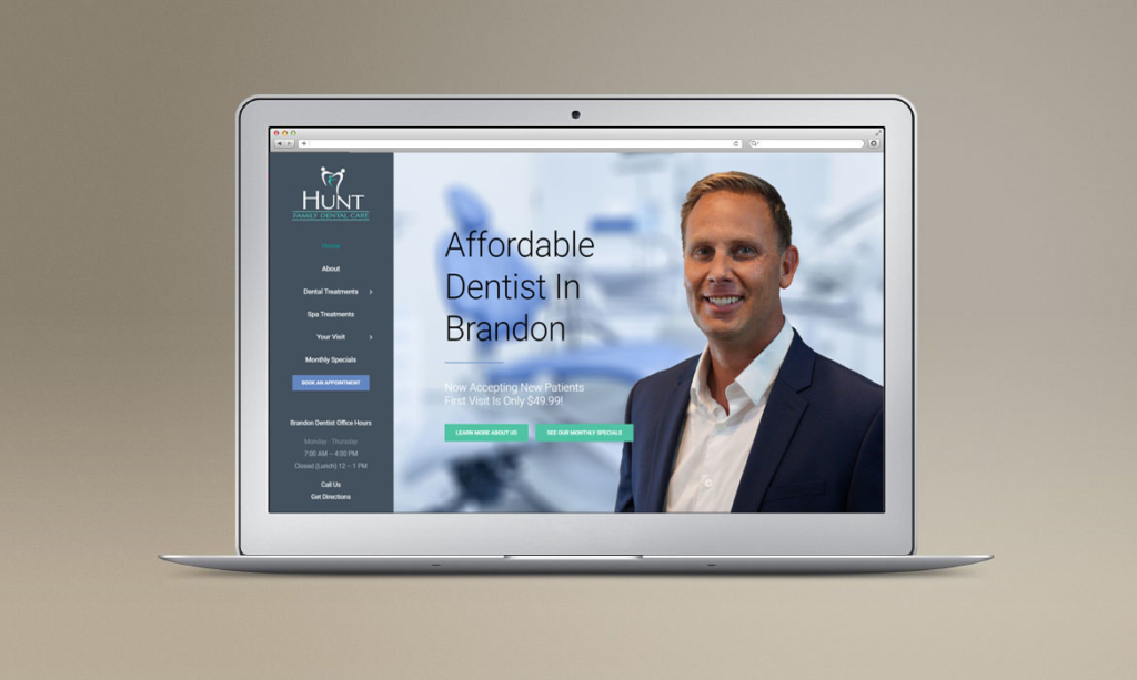
We like everything simple, minimalistic, and a little unconventional. On computers and laptops (like this site) the menu is on the left instead of the traditional spot at the top. We used big imagery and our photographs to show clients getting excellent treatment not only at the dental offices but also in the dentist’s office med-spa.
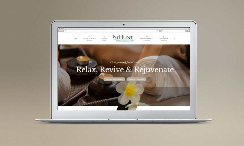
The Med spa is a seperate website with a totally different look to cater to their med spa clientele. The menu moved back to the top but we left the design elements of big imagery and our photographs to show clients getting excellent treatment.


We’re Here To Help Your Business Grow!
Through Creative Ideas, Innovation & Sheer Determination
